Light and Color
Using Light
As was true with photos, getting the lighting correct is very important
for graphics that look good. However, unlike photos where we had
to work with the light that the camera had, where the best we could do
was improve it, here we have complete control of how the lighting
affects the image. However, with all that control means that we
need to plan ahead and determine what lighting we want, whereas in
photos we could just look at what we were given and figure out how to
make it as good as it could be.
Here's an example of an open cardboard box, without any lighting
applied.

And here is that same box, with lighting applied to it.

Its easy to see the difference! In this case, the author imagined
the source of the light to be above and a little to the left of the
box. So you can see the shadow coming down from it and to
the right. Also the right-front face of the box is darker than
the left-front face of the box, because some light is on the left-front
face, coming a bit from the left side, whereas the right-front face is
in the shadow. Also, the inside of the box is in shadow because
the walls
are limiting how much light can get in.
If you look closely you may figure out that there is no way the box
could physically be lit like this, the angles of lighting simply aren't
possible, but that's not important. What is important is that
there is some aspect of lighting, and that gives the eye enough to
separate out the different surfaces, unlike in the first picture.
In graphics, unlike photos, it isn't necessary to make the lighting
super realistic, the audience isn't expecting that from graphics, but
there still needs to be enough to be pleasing to the eye.
Using Color
When the human eye sees color, it is actually recording electronic
waves of light hitting cells in the back of the eye. A single
particle of light is called a photon, and each photon oscillates at a
specific frequency, which corresponds to a wavelength. Photons
with a faster frequency (and shorter wavelength), are towards the
violet end of the spectrum, while photons with a lower frequency (and
longer wavelength) are towards the red end of the spectrum.
Below is a graphic depicting the spectrum of visible light.

You may notice that the two ends are dark, these are actually not
black, rather they glow just as brightly as all the areas in the
middle, but in the infra-red and ultra-violet colors that the human eye
cannot detect.
The colors above are the only colors that the human eye can
detect. You may notice that there are many colors missing: brown,
purple, not to mention white, black, and gray. This is because
these colors (and many more) don't actually exist, but we perceive them
because of how the photons of light hit our eye. To learn more
about the visible spectrum of light, see this page: http://en.wikipedia.org/wiki/Visible_spectrum
http://es.wikipedia.org/wiki/Espectro_visible
When we see an area that is black, that is because very few or even no
photons are hitting our eye from that direction. On the other
hand, when we see the an area that is the color white, we are getting a
lot of photons, from every single color hitting our eye at the same
time. Gray is simply in between that, when we see a medium number
(too many = white, too few = black) of photons, from all the different
colors of light, we will see gray. All the other colors are found
by having photons at two or more different frequencies hit the same
part of the eye at the same time. For instance, if we have two
photons of red for every one photon of green (and no other colors),
then we will see brown in that area. If we see one photon of red
and one of blue, we will see purple.
So, brightness of the color is determined by the total number of
photons, and what color we see is determined by what frequency or
combinations of frequencies the photons have when they strike our eye.
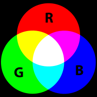
As we learned in the photo section, when a computer monitor projects
light out to our eyes, it is projecting Red, Green and Blue.
These colors can be added together to make all the other colors.
However, when we print an image out onto a piece of paper, the paper
isn't projecting light into our eyes like a computer screen is, rather
it is reflecting the light in the room. When we were projecting
light, we started with black, and added colors to get the color we
wanted...if we wanted to get to white, then we added all the
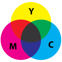
colors. However, when we talk about reflecting light, we start
with a white light, then we start taking away parts of that white
light, by absorbing the photons of certain colors, so that only the
color we want is still being reflected. If we absorb all the
light and don't reflect any, then we are left with black. For
this reason, printers use the colors Cyan, Magenta, and Yellow for
their printing. Cyan will absorb Red, Magenta will absorb Green,
and Yellow will absorb Blue.
For more on reflected or "subtractive" color, see: http://en.wikipedia.org/wiki/Subtractive_color
http://es.wikipedia.org/wiki/Síntesis_sustractiva_de_color
As you can see in the images of the box, in the previous section on
lighting, the changes in lighting affected the
color of the image, and it is important that the colors you use match
with the lighting that you are applying to your image. However,
more general color choices also will affect your image. If you
are attempting to create a representation of something real, like a box
or a forest, then you need to make your colors close to those of what
would be realistic for those objects. On the other hand,
sometimes you are making graphics that don't correspond to something in
real life. For instance, in a logo for a company or the color of
text in a banner. In this case, you need to choose color
combinations that work well together and don't clash.
Unfortunately, colors that do and do not work well together vary by
culture. Colors that go well together in the United States won't
work well together in Africa. The same way, colors that clash in
India might work well together in Peru. To see a quick example of
this, look at a sample of flags from different countries. Each
country picks a flag with colors that work well together in that
country, but I'm sure you can see some that do and don't look like they
belong together in your culture!

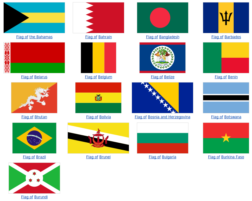
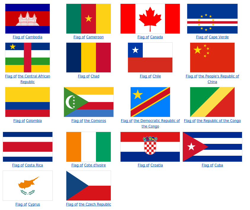
That's just the countries that start with A, B, and C and there's
already a whole ton of different color combinations. We could go
on for a very long time (which we don't have) on the theories of what
colors are good together and which are bad. Indeed many artists
will have to take several classes that revolve around this. Just
keep in mind that there are colors that go well together, and look for
them as you create graphics. It also might be a good idea to ask
someone for their opinion of which colors they think will go well
together in your graphic.