The program we will be using for vector graphics, Inkscape, comes
with a great overview of some of the design elements we'll be using
throughout this course. Utilizing its license for
re-distribution, it
has been copied below and is also available from the program by
clicking Help -> Tutorials -> Elements of Design.

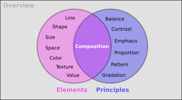
The following elements are the building blocks of design.
A line is defined as a mark with length and direction, created by a point that moves across a surface. A line can vary in length, width, direction, curvature, and color. Line can be two-dimensional (a pencil line on paper), or implied three-dimensional.

A flat figure, shape is created when actual or implied lines meet to surround a space. A change in color or shading can define a shape. Shapes can be divided into several types: geometric (square, triangle, circle) and organic (irregular in outline).

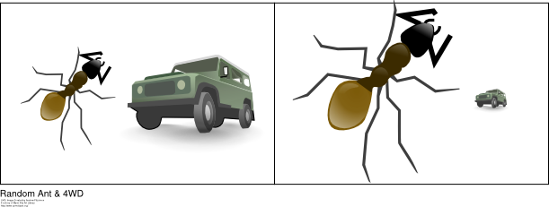
This refers to variations in the proportions of objects, lines or shapes. There is a variation of sizes in objects either real or imagined.

Space is the empty or open area between, around, above, below, or within objects. Shapes and forms are made by the space around and within them. Space is often called three-dimensional or two- dimensional. Positive space is filled by a shape or form. Negative space surrounds a shape or form.

Color is the perceived character of a surface according to the wavelength of light reflected from it. Color has three dimensions: HUE (another word for color, indicated by its name such as red or yellow), VALUE (its lightness or darkness), INTENSITY (its brightness or dullness).

Texture is the way a surface feels (actual texture) or how it may look (implied texture). Textures are described by word such as rough, silky, or pebbly.

Value is how dark or how light something looks. We achieve value changes in color by adding black or white to the color. Chiaroscuro uses value in drawing by dramatically contrasting lights and darks in a composition.

The principles use the elements of design to create a composition.
Balance is a feeling of visual equality in shape, form, value, color, etc. Balance can be symmetrical or evenly balanced or asymmetrical and un-evenly balanced. Objects, values, colors, textures, shapes, forms, etc., can be used in creating a balance in a composition.

Contrast is the juxtaposition of opposing elements

Emphasis is used to make certain parts of their artwork stand out and grab your attention. The center of interest or focal point is the place a work draws your eye to first.

Proportion describes the size, location or amount of one thing compared to another.

Pattern is created by repeating an element (line, shape or color) over and over again.

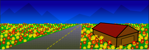
Gradation of size and direction produce linear perspective. Gradation of color from warm to cool and tone from dark to light produce aerial perspective. Gradation can add interest and movement to a shape. A gradation from dark to light will cause the eye to move along a shape.

The combining of distinct elements to form a whole.

This is a partial bibliography used to build this document.
Special thanks to Linda Kim (http://www.redlucite.org) for helping Jon Phillips (http://www.rejon.org/) with this tutorial. Also, thanks to the Open Clip Art Library (http://www.openclipart.org/) and the graphics people have submitted to that project.